

Overview: The Affinity MCP lets you turn a pipeline list you already keep in Affinity into charts, rankings, and a single dashboard, all in plain language. Instead of exporting to Excel or building something in Affinity Analytics, you describe the view you want and Claude pulls the live data and builds it as an artifact (a panel that opens next to the conversation). This guide walks through the views covered in an Affinity office hours session on visualizing deal flow pipelines with MCP.
Note: the pipeline examples referenced throughout come from Affinity’s demo environment. Your own charts will reflect whatever fields and naming your team actually uses.
What you can do
- Get an instant read on how deals are distributed across pipeline stages
- See the same data as a funnel to spot where deals are stalling
- Check team workload by deal owner, and get a suggestion for who has room to source more
- Rank your biggest bets by total investment amount
- Combine multiple views into a single dashboard artifact for a partner meeting or IC deck
- See how long deals have been sitting in a given stage
- Pull a log of which fields changed, when, and by whom
Prerequisites
- Affinity MCP connected in Claude (or another MCP client)
- A maintained pipeline list in Affinity, since Claude reads directly from it and no new data entry is needed
- Stage, owner, and investment amount fields populated on that list, since Claude reads whichever fields you ask about
- A few minutes of patience for the combined dashboard, since it aggregates more data than a single chart
Use case 1: Stage distribution at a glance
When to use it: You want a pulse check before a pipeline meeting: are you top-heavy with new inbound, or mostly late-stage deals? How to do it: Open Claude with the Affinity MCP connected and ask: “Using my [pipeline list name] in Affinity, count how many deals are in each stage and show it as a bar chart with stage on the x-axis and number of deals on the y-axis. Create the bar chart as an artifact.” Claude will call the Affinity MCP, pull every entry on the list, read the stage field on each one, and total it up before building the chart. This typically takes 20-30 seconds; the more deals on the list, the longer the count takes. Note: the more specific you are, the better the result. Name the exact list and the exact chart type. A vague prompt like “show me my pipeline” won’t reliably produce the same chart twice.Use case 2: Deal flow funnel
When to use it: You care about flow, not just counts: how deals move through the pipeline, and where they stall. How to do it: In the same conversation, follow up with: “Now show that same stage breakdown as a funnel chart ordered from the earliest stage down to the latest, so I can see how deals narrow as they move toward a term sheet. Create the funnel chart as an artifact.” Because Claude already pulled the pipeline data for the bar chart, this reshapes what it already has rather than re-querying Affinity, so it runs faster. A short funnel at the top usually points to a top-of-funnel sourcing gap; a wide bulge in the middle can mean a bottleneck, for example a backlog in IC review. This is the view worth bringing to an IC discussion or a quarterly LP update, since it shows discipline in moving deals forward, not just volume.Use case 3: Team workload by owner
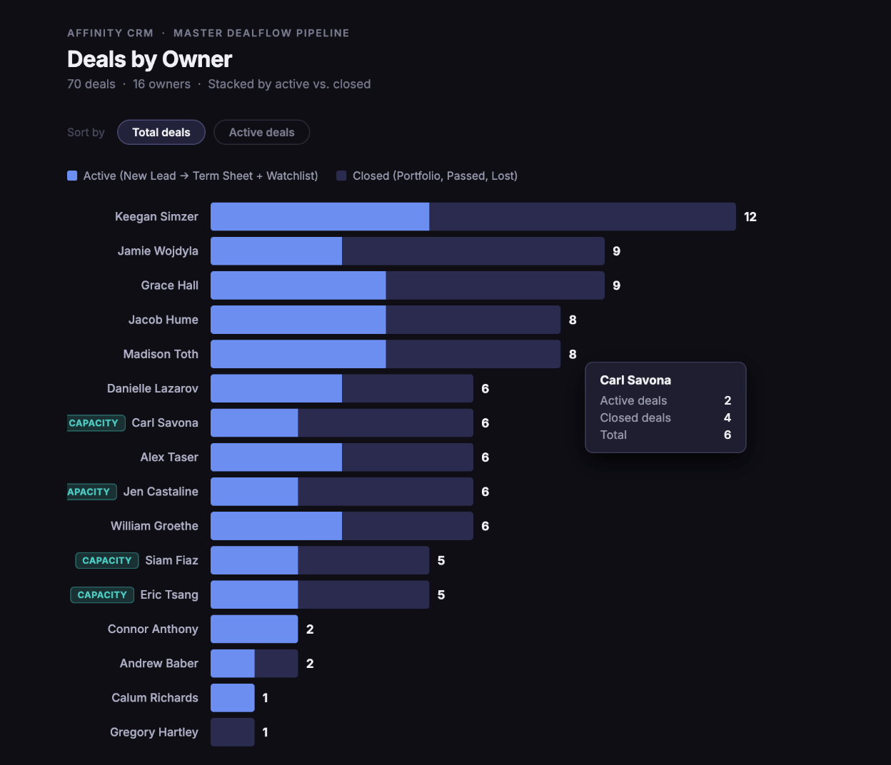
When to use it: You want to know how work is distributed across your team, and whether anyone has room to take on more sourcing. How to do it: Ask: “From my [pipeline list name], count how many deals each deal owner has and show it in a bar chart. Are there any owners who might be able to take on sourcing new deals?” Claude reads the owner field instead of the stage field and groups by person; it isn’t learning anything new about your data, just pointing itself at a different field already in Affinity. Beyond the chart, Claude will often read the pattern and make a suggestion, for example flagging an experienced owner with a healthy deal count but low active load as a candidate for more sourcing. That’s the MCP acting as a thought partner, not just a chart generator.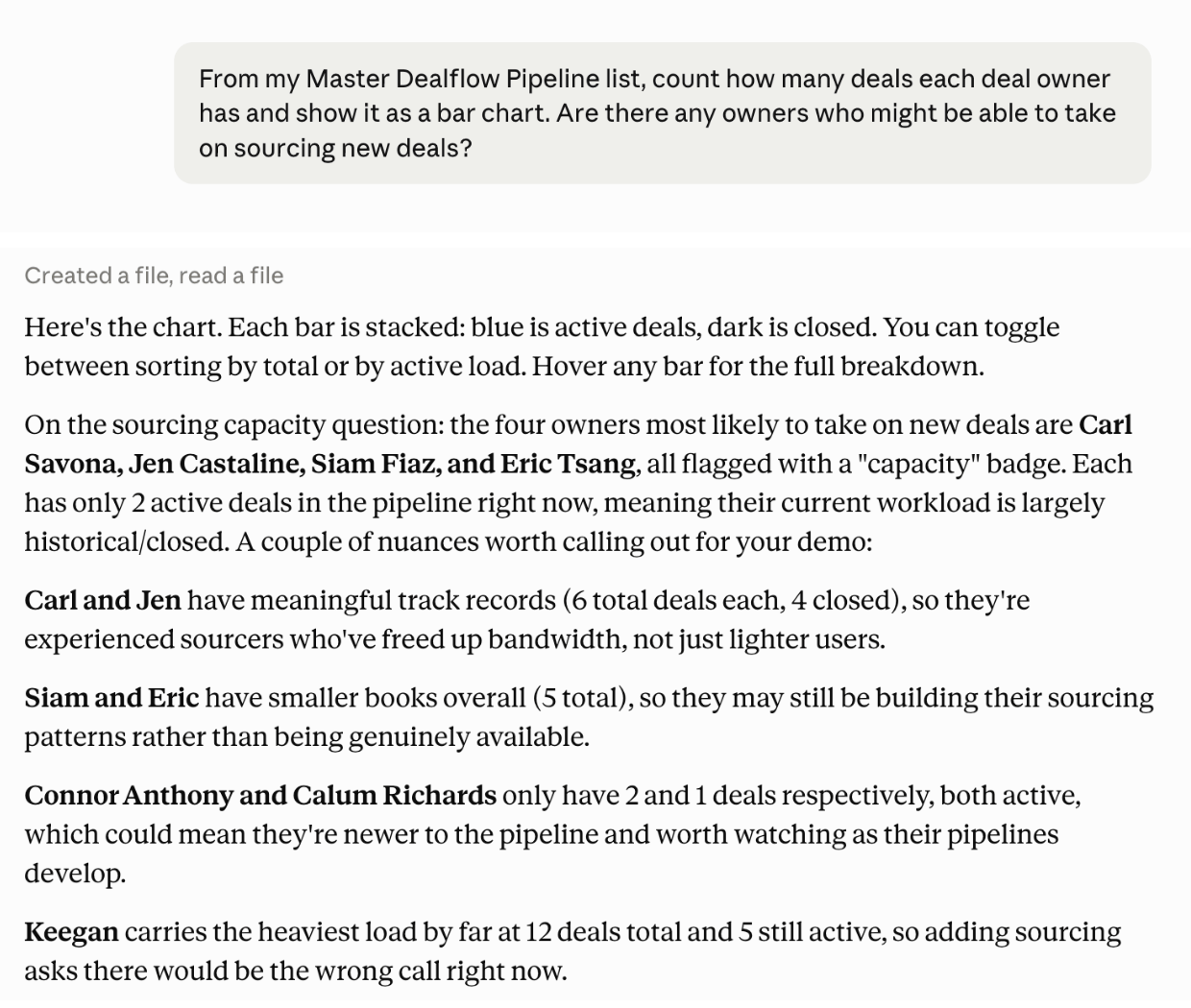
Use case 4: Biggest bets by investment amount
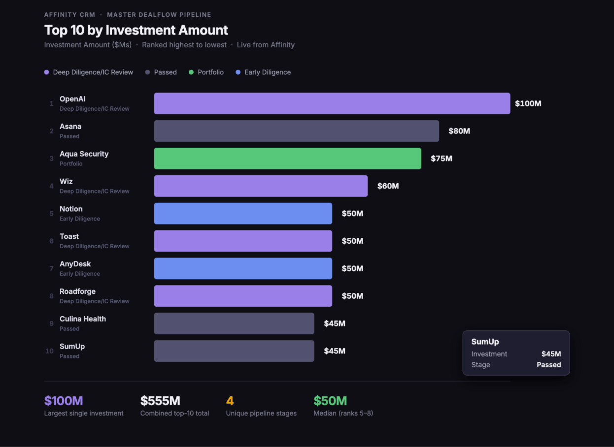
When to use it: You need to see where the most capital is concentrated, for example ahead of an LP question about where the fund is leaning. How to do it: Ask: “Show me the top 10 organizations in my [pipeline list name] by total investment amount as a horizontal bar chart ranked from highest to lowest.” Claude pulls the investment amount field your team has recorded for every organization on the list, sorts it, and ranks the top 10. A horizontal bar chart reads easier here since company names work better as labels than as tick marks; that kind of formatting instruction is worth including directly in the prompt. The output is ready to drop straight into an IC deck or LP update.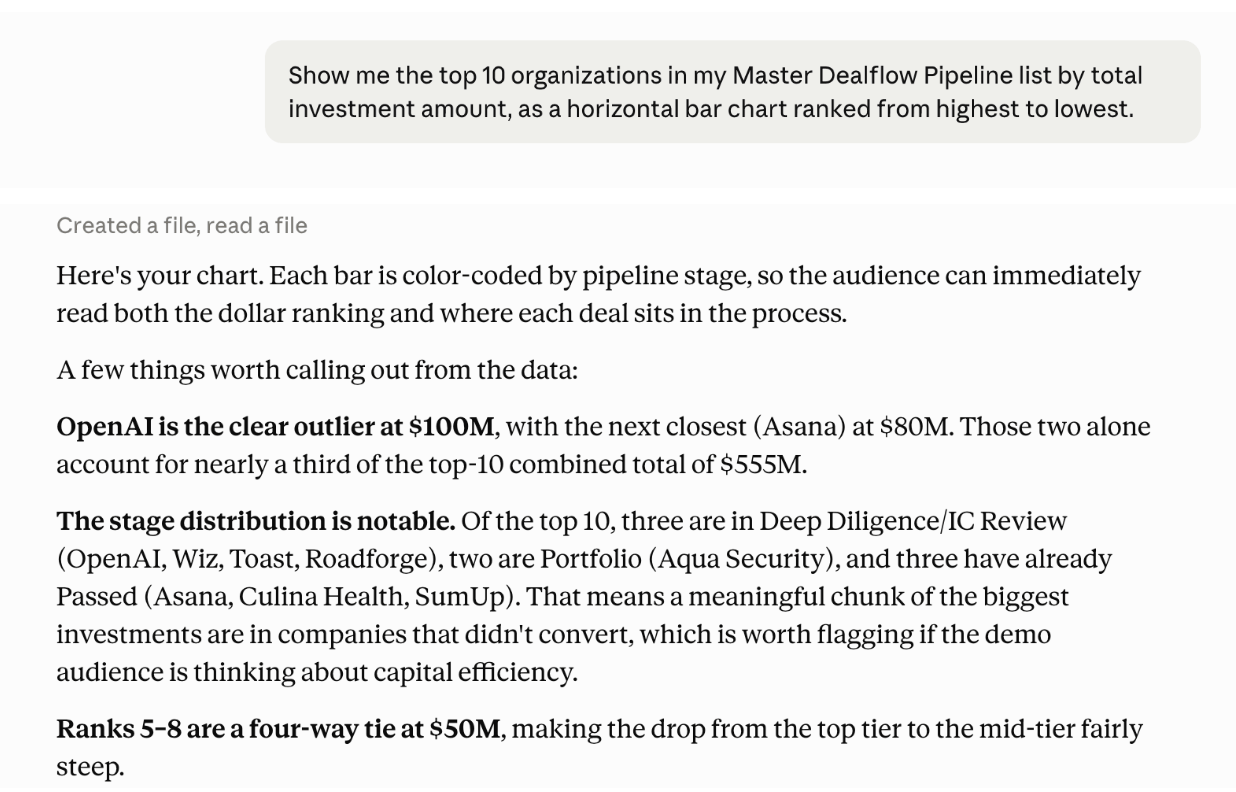
Use case 5: One combined dashboard
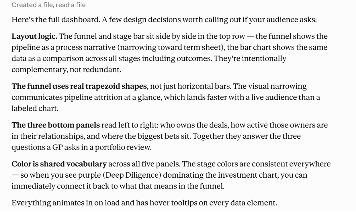
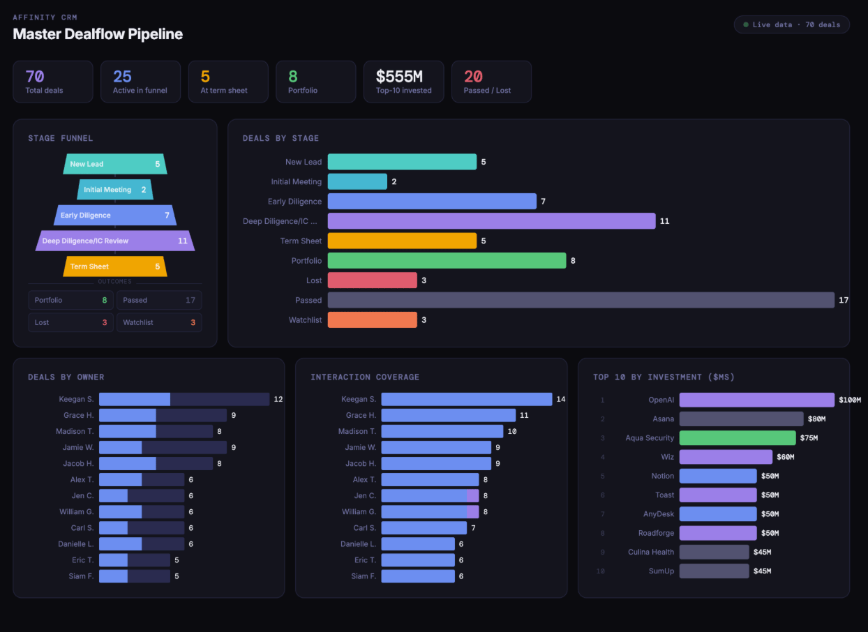
When to use it: You don’t want to ask four separate questions or flip between four charts in a meeting. You want one screen that tells the whole story. How to do it: Once you’ve asked for the views above in the same conversation, ask: “Now combine all four of these into a single dashboard artifact: deals by stage, the stage funnel, deals by owner, and the top 10 organizations by investment amount. Lay them out so I can see the whole pipeline at a glance.” Because everything it needs is already in the conversation, Claude doesn’t re-query Affinity; it just arranges the data it already pulled. This is the heaviest ask of the five use cases here, since it’s aggregating and laying out multiple views, so expect it to take roughly a minute.
Use case 6: How long deals have been sitting in a stage
When to use it: You want to know whether deals are stalling in a specific stage, not just how many are there. How to do it: Ask: “How long have my deals been sitting in [stage, for example IC review]?” Claude can see when a status was last changed and calculate how long a deal has been sitting there since. It may return this first as a table (for example, a range and a median) and then offer to turn it into a horizontal bar chart; say yes if you want the visual. What this can’t do yet is reconstruct a past point in time, so you can ask how long something has been in its current stage, but not what the pipeline looked like at the end of last quarter.Use case 7: Recent status-change log
When to use it: You want a log of what changed on your pipeline recently, and who made the change. Useful for a quick data-quality check or a team standup. How to do it: Ask: “What deal statuses have changed in the last seven days? For each one, tell me the company, what changed, and who made the change.” Claude returns a change log: when each change was made, the company, what the change was, and who made it. This draws on the same status-change timestamps used for the time-in-stage view above.Tips for getting better results
- Name the exact list. “My pipeline” is ambiguous; “my Master Deal Flow Pipeline list” isn’t.
- Ask for a specific chart type and axis layout. Bar, funnel, and horizontal bar all produce different results, so say which one and what goes on which axis.
- Build on the conversation. Once Claude has pulled your pipeline data, follow-up requests to reshape or combine it run faster and don’t require re-explaining the list.
- Say “as an artifact” if you want the visual. Claude may return a table first and offer to chart it; you can also just ask for the artifact directly.
- Save the prompt you like, not the output. Since artifacts are static, the reusable part of this recipe is the prompt itself. Paste it back in whenever you need current numbers, or turn it into a Claude skill or project if it’s a report you run every week.