Advanced — power-user technique.
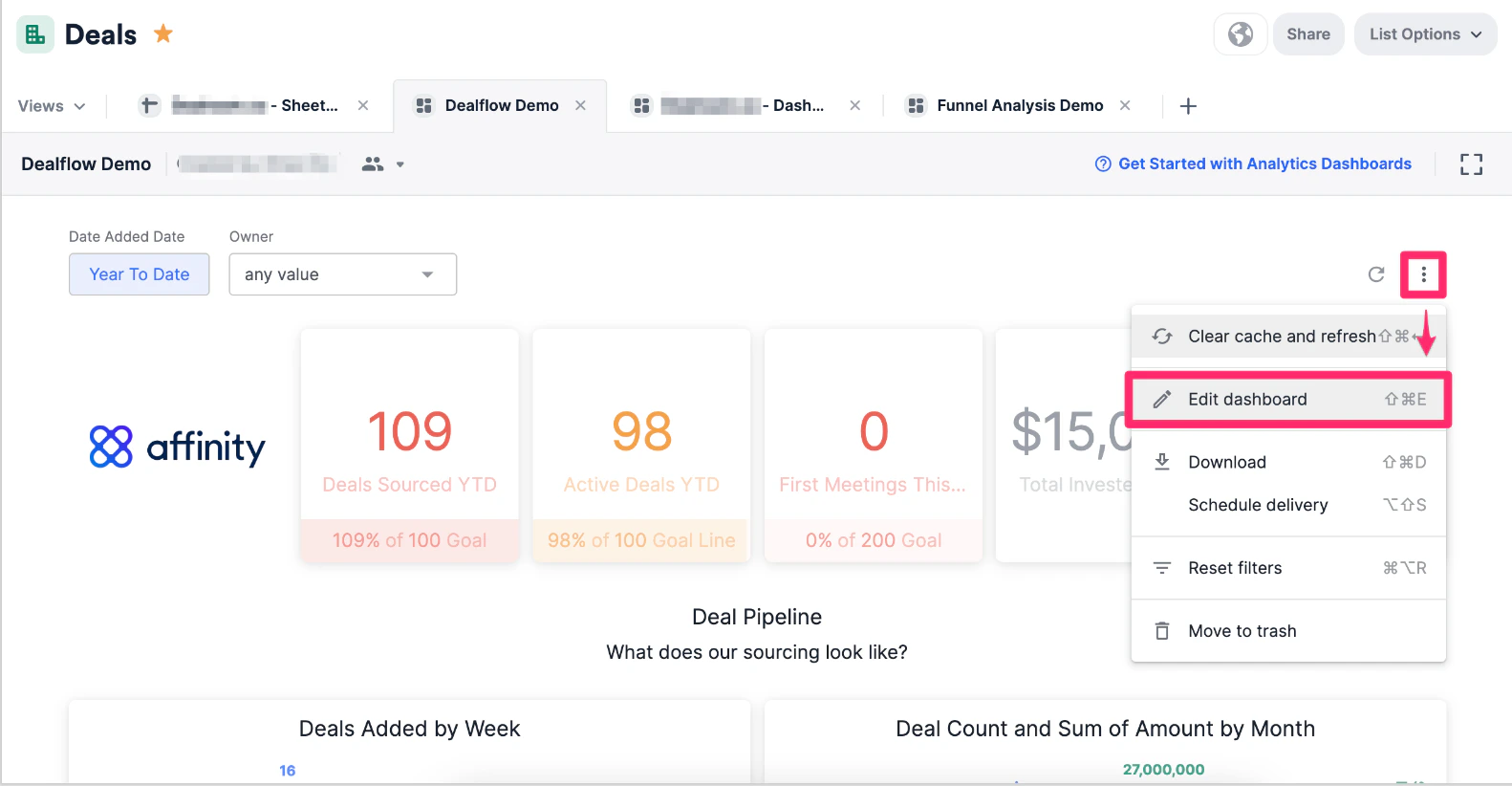
- Click the ellipsis (3-dotted icon) and click Edit dashboard in the dashboard view you’d like to create the visualization in.
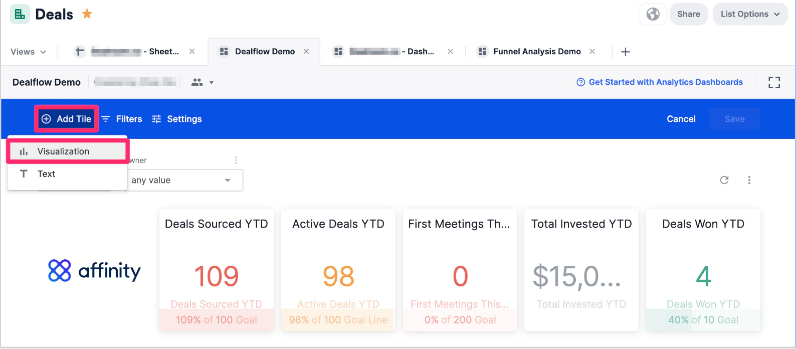
- Click Add tile, then choose Visualization.
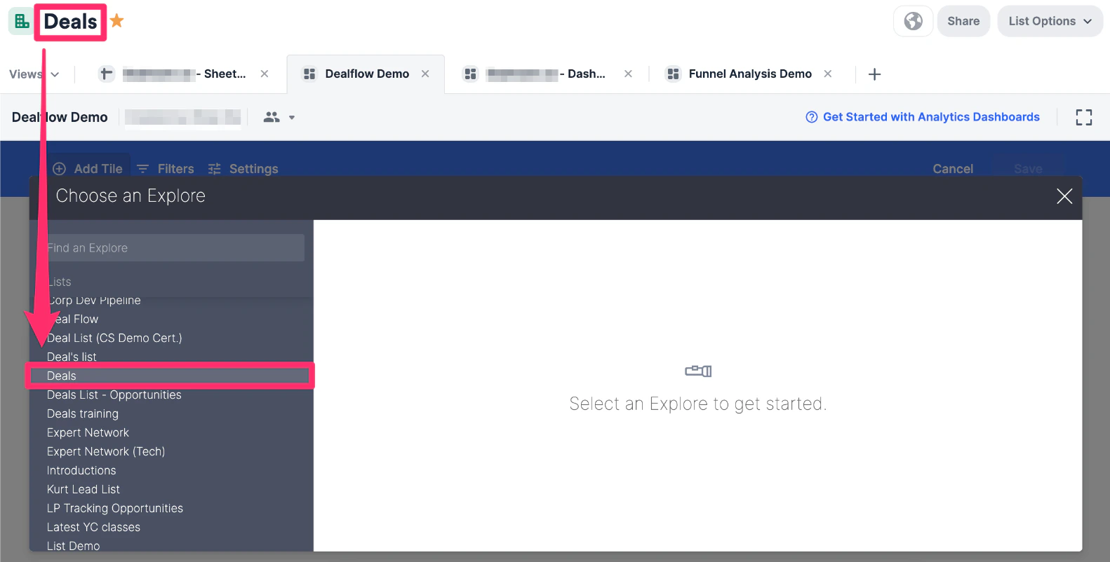
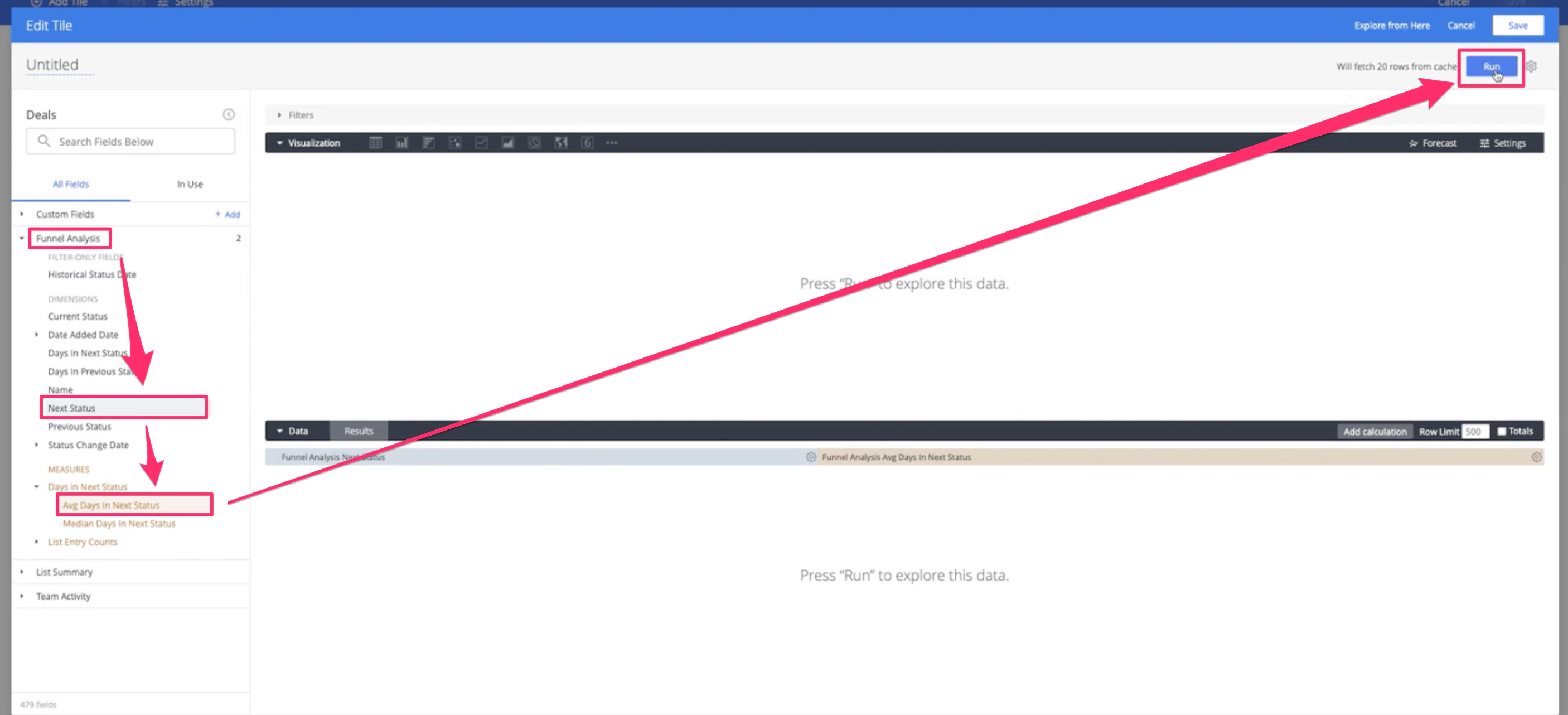
- Choose the list or data source for your funnel. We highly recommend that you choose the list you’re currently on.
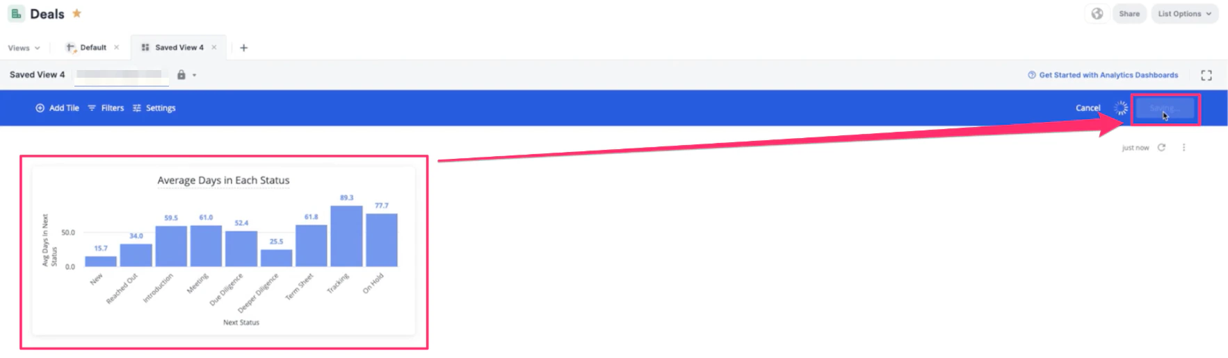
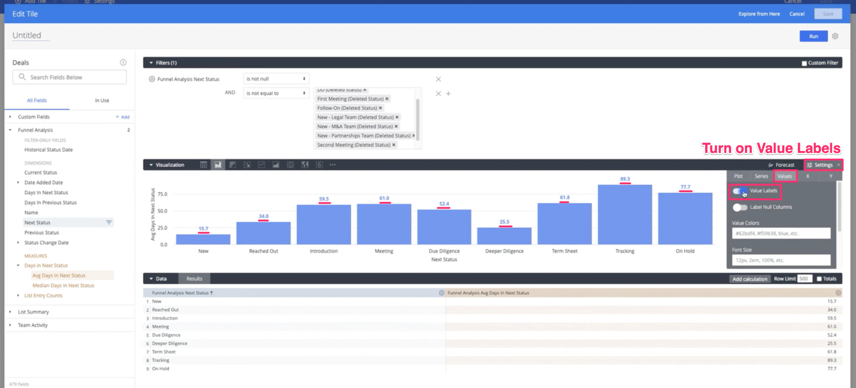
- For this visualization, we’ll use the Funnel Analysis data points: select Next Status for the dimension, then select Average Days in Next Status for the measure, then click Run.
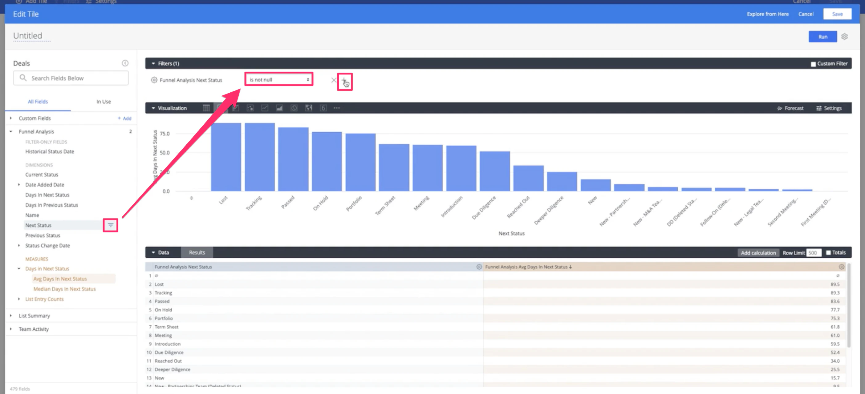
- Make sure to filter out null values in the Next Status dimension. Then, click the + icon right next to it to filter out more values as shown in Step 6 below.
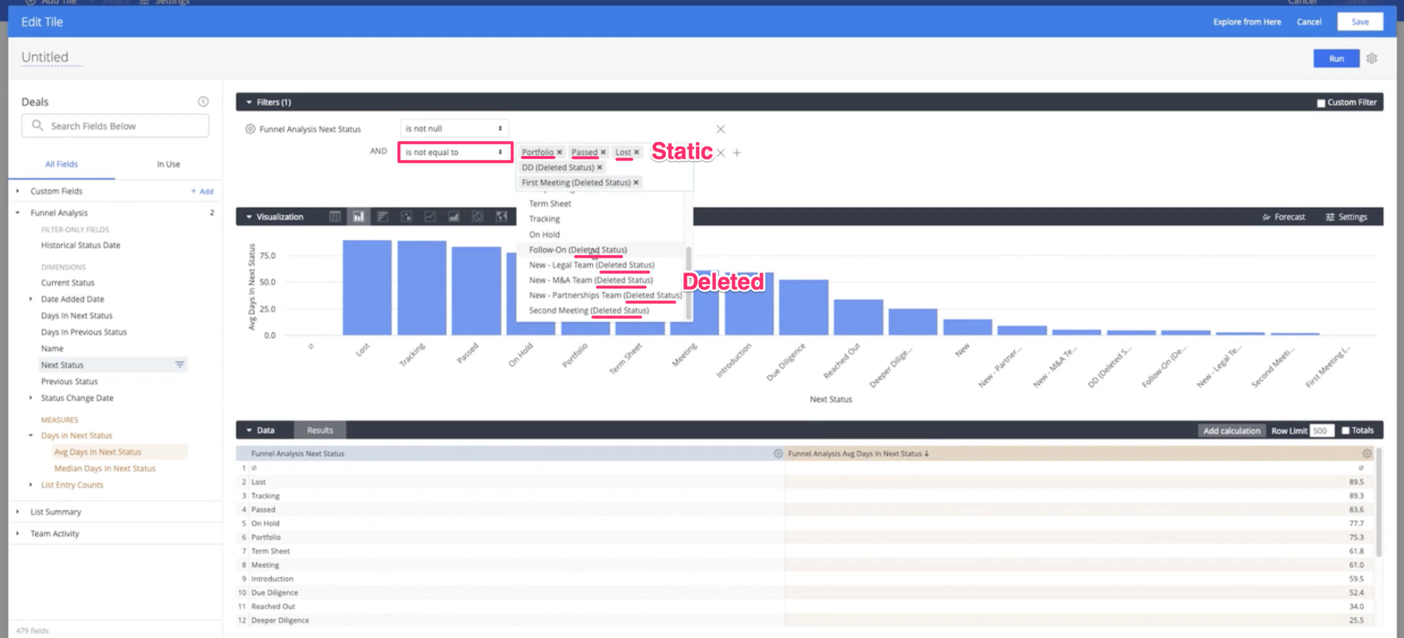
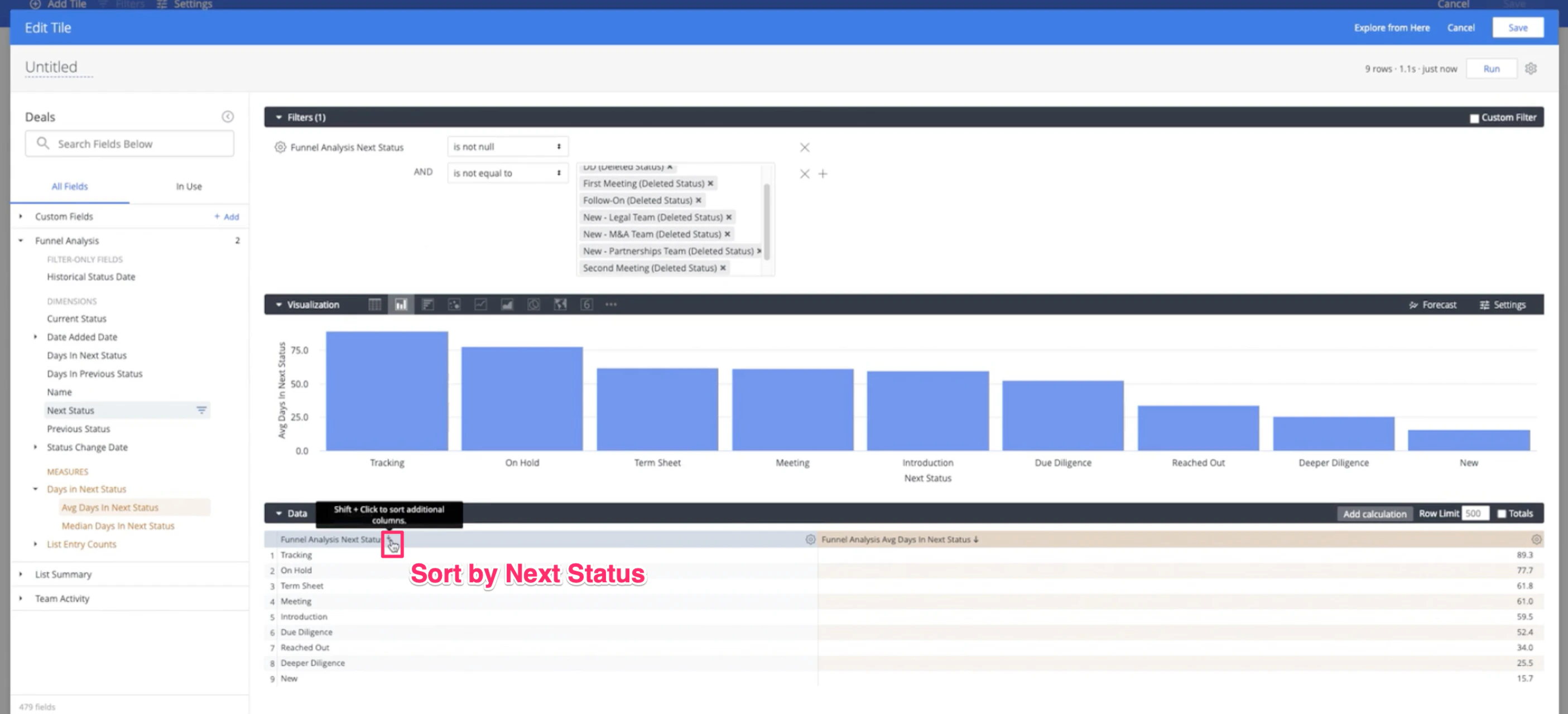
- Make sure to also filter out deleted statuses and static statuses in the Next Status dimension. 1.
- Sort the Next Status dimension from first to last. This will sort the statuses in the Open category by the order that has been set in the default Status column.
- Click on Settings within the Visualization section, then click the Values tab to Add value labels.
- Name your visualization, then click Save.
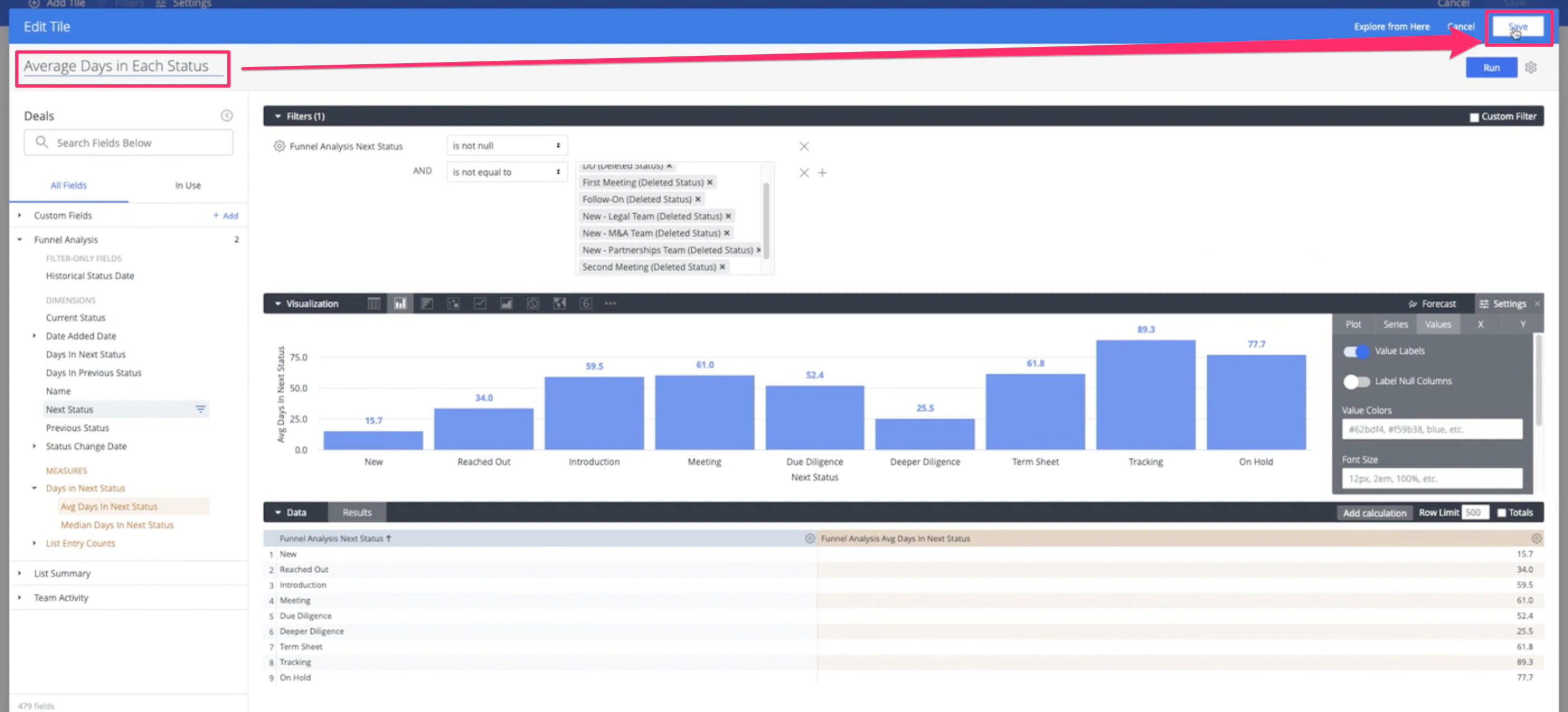
- Now, you’ll see what stages of the pipeline you/your team are spending the most time in and can improve upon moving forward. Click Save one more time for your entire dashboard view, and you’re all set!