How-to — task-oriented recipe.
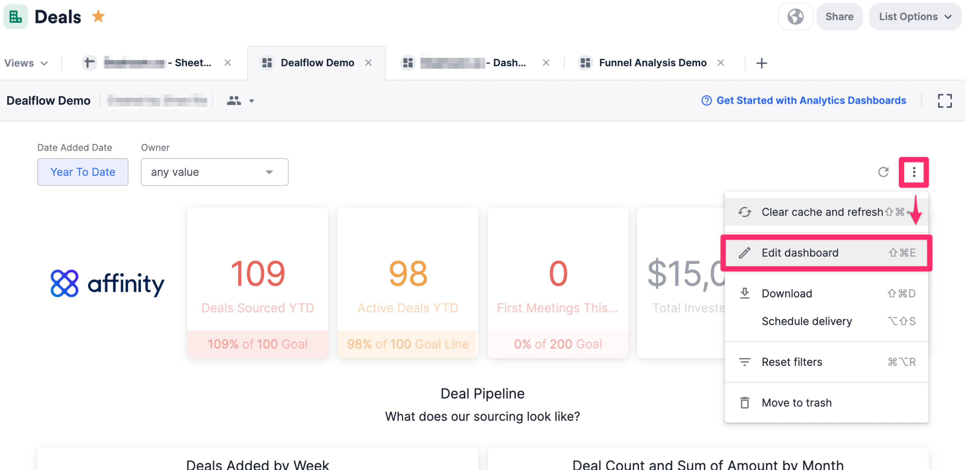
- Click into the dashboard view you’d like to create this new tile on. Then, click the ellipsis (3 dotted icon) and click Edit dashboard.
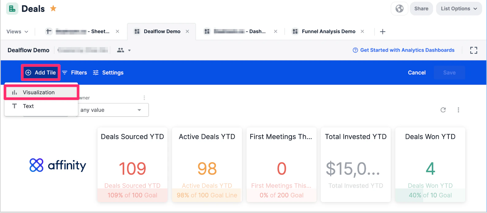
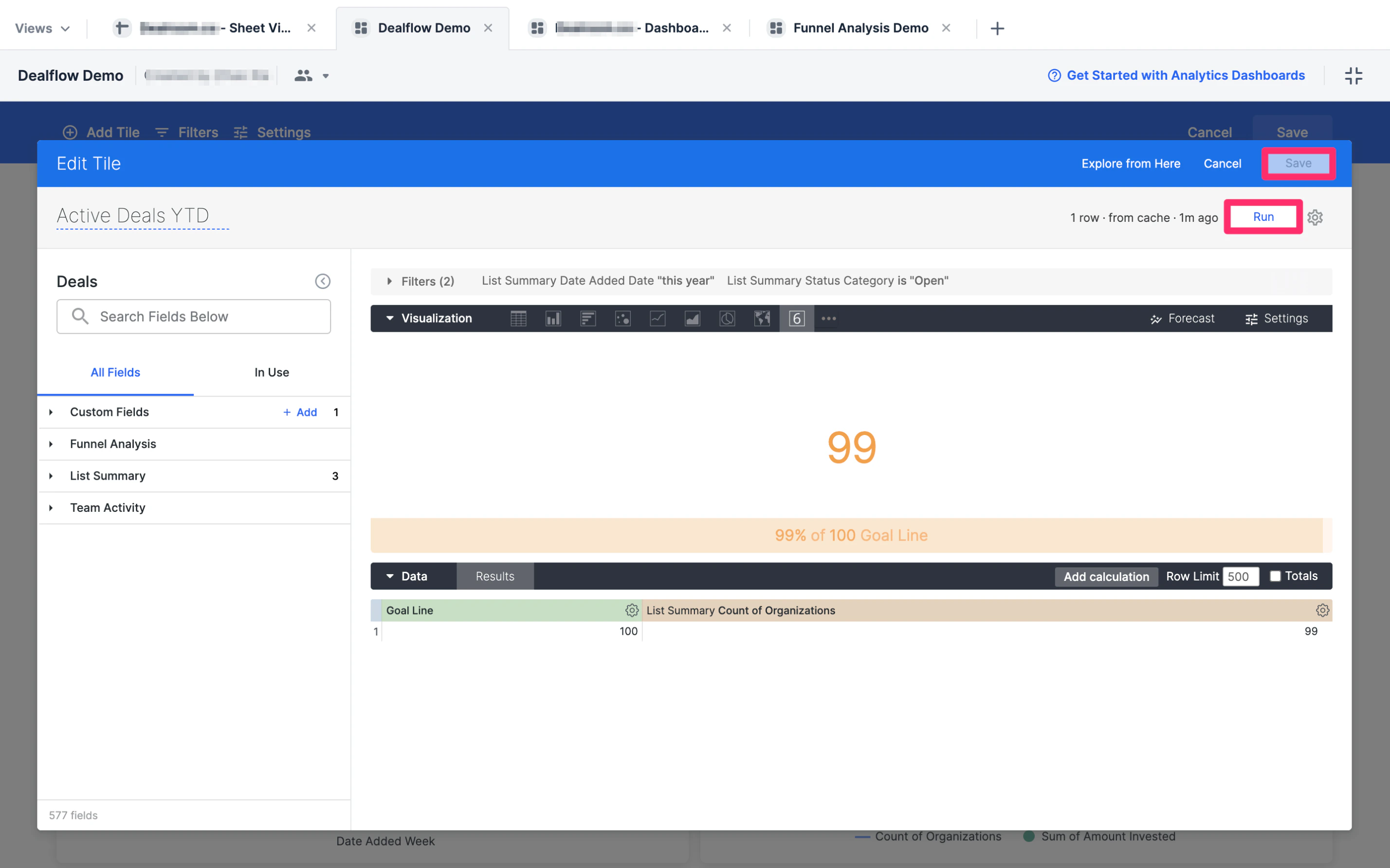
- Click Add Tile to create a new Visualization tile.
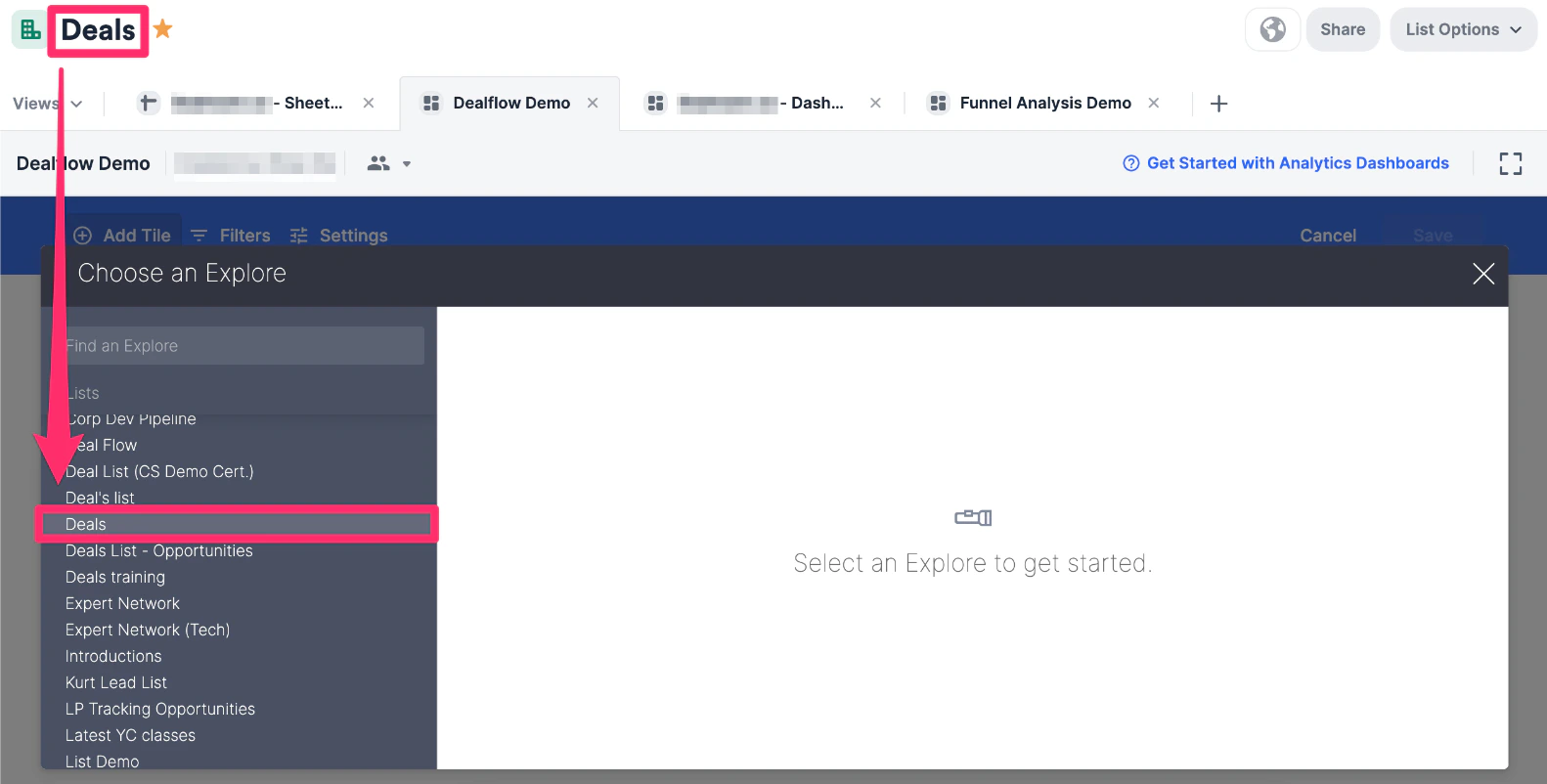
- Once the Choose an Explore modal opens up, select the list you’re currently on.
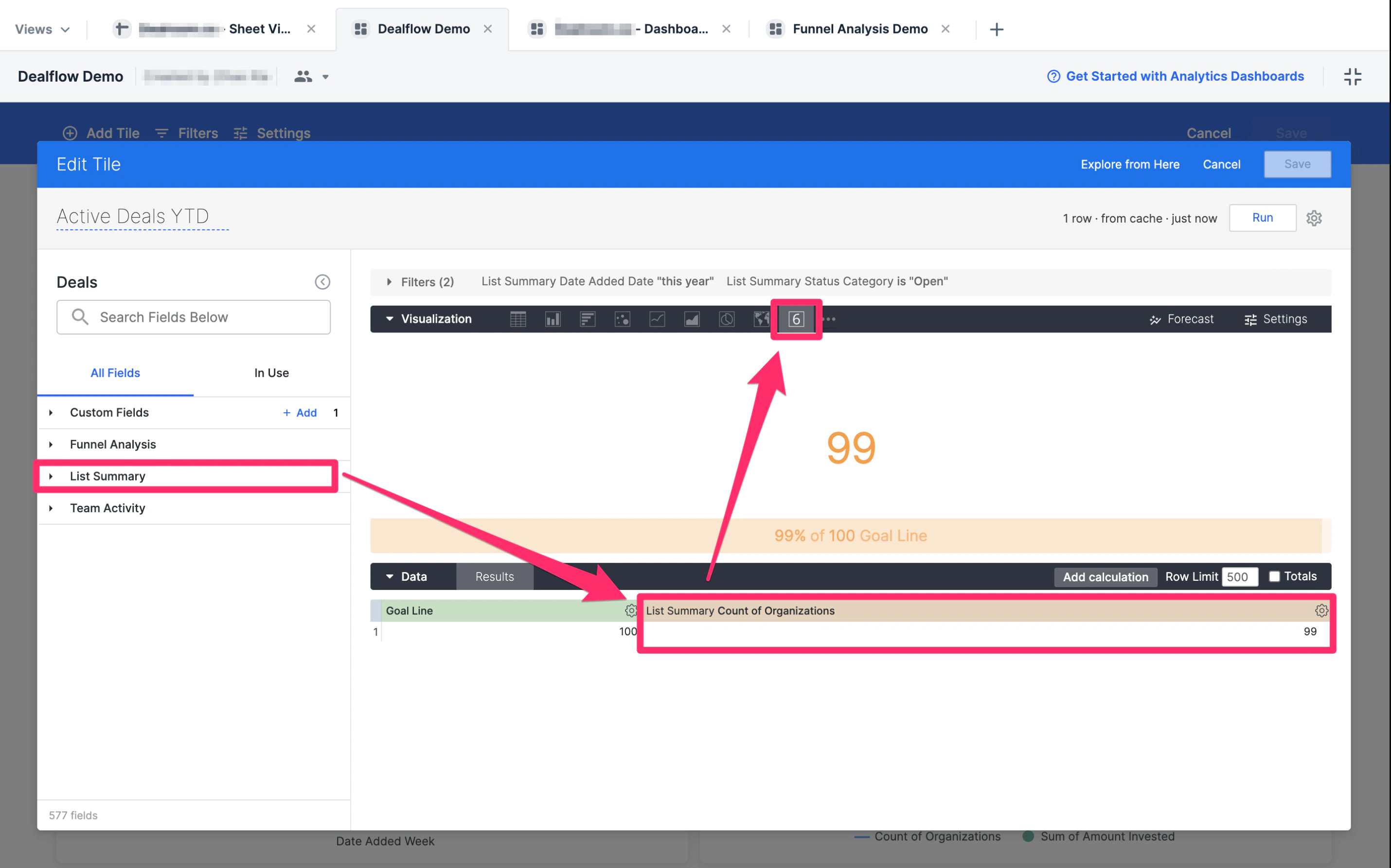
- Within the List Summary section on the left side, select Count of Organizations as the measure, then make sure the visualization style is set to Single Value.
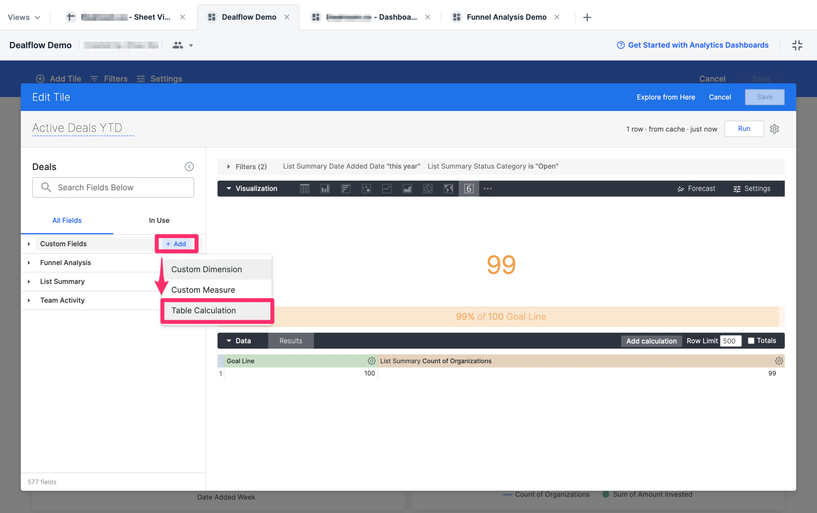
- Now, click on + Add in the Custom Fields section to create a Table Calculation.
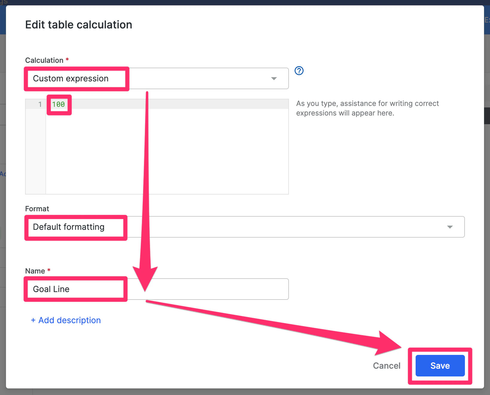
- Set the Calculation field value to Custom expression, then add a number in the text box - in this example we’ll use 100. Then, set the Format field value to Default formatting and create a name for this custom field (i.e. Goal Line), then click Save.
- You’ll now see your custom field (i.e. Goal Line) appear in the Data section.
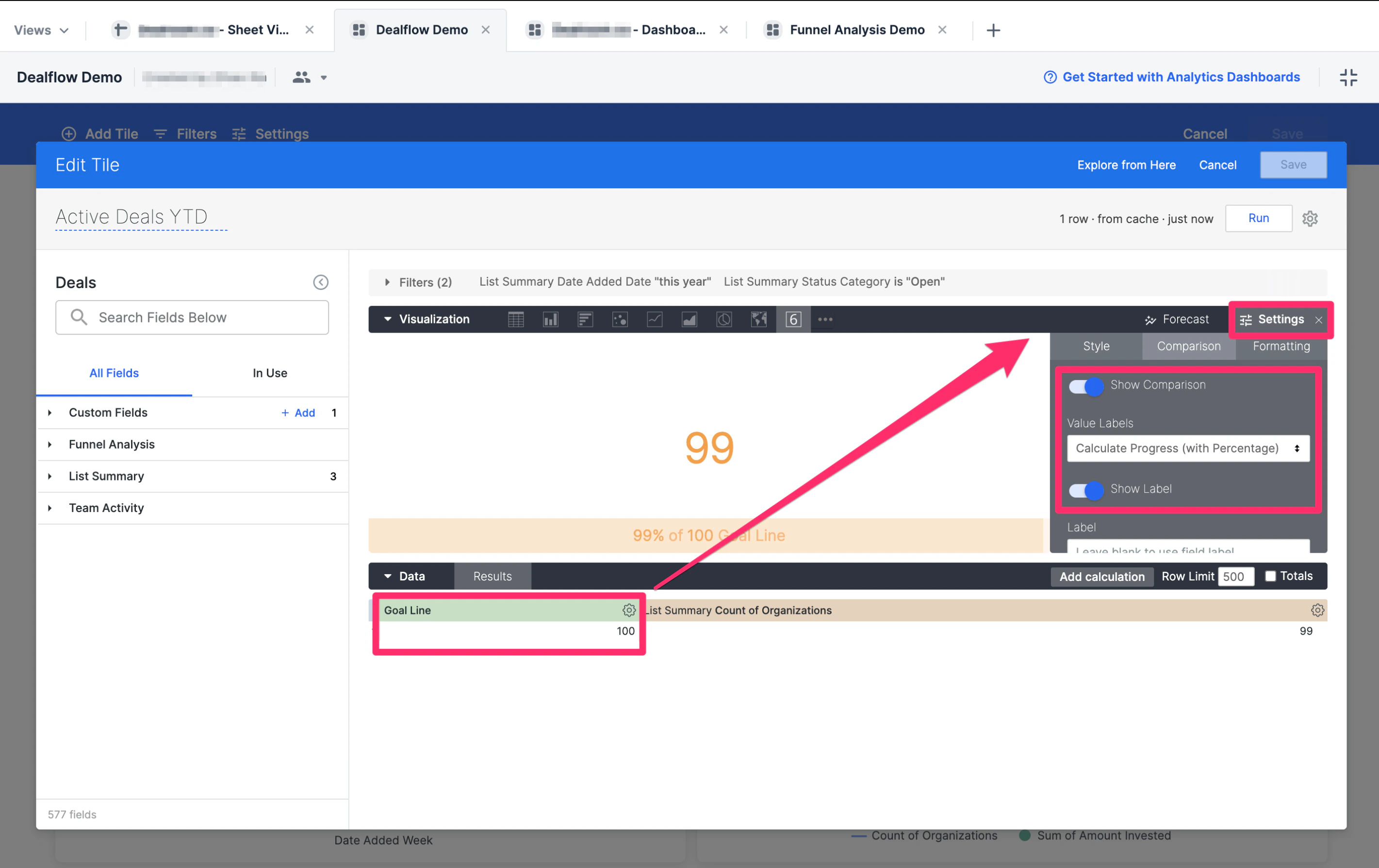
- Now, click on Settings on the right-side of the Visualization section, then click on the Comparison tab.
- From there, set the Value Labels field value to Calculate Progress (with Percentage), then toggle on Show Comparison and Show Label.
- Click Run, then click Save to make sure the tile is created.
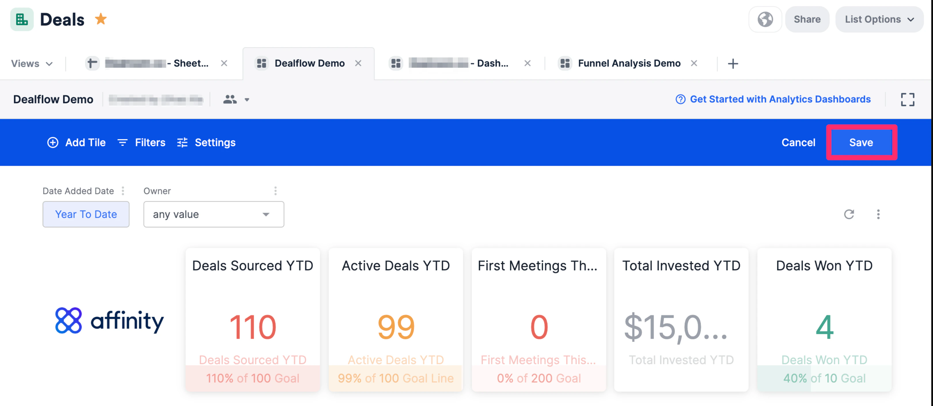
- Click Save on the top-right corner to save the changes you made for the entire dashboard view and you’re all set.