Reference — lookup information.
Who can access Affinity Analytics?
Interested in upgrading to Scale, Advanced, or Enterprise? Please reach out to your Affinity point of contact or support@affinity.co.
Understanding your role (Viewer or Creator)
- When Affinity Analytics is turned on for your account, all Enterprise Admins (for Enterprise tier customers) and Admins in the account will be assigned the Creator role by default.
- On the other hand, all Standard users will be assigned the Viewer role by default.
- Want to switch from a Viewer to a Creator?
- Please reach out to support@affinity.co with one of your admins CC’ed on the email thread.
- Not sure who your admins are? Check out the section “How to find your account role and view permissions for each role” in the article Account Level Permissions.
- Last but not least, have them provide written permission agreeing to your request. Once doing so, our Support Team can change your role accordingly.
Starting with the basics
Once you have access to Affinity Analytics, you can start with our Creating Visualizations video series. Then, click on the links below if you’d like to focus on a particular step in the overall process - we suggest watching them in sequential order:- How to create a new dashboard view (Creators only)
- How to create and edit tiles in dashboard views
- How to apply filters in dashboard views
- How to pivot data on your dashboard views
- How to export dashboard views (for yourself and others)
- How to set up automated alerts for Affinity Analytics
- How to duplicate tiles and dashboard views in Affinity
- Troubleshooting common issues for Affinity Analytics
Moving on to more advanced features
Once you’re familiar with the basics, feel free to check out the more advanced visualizations you can create:- How to set win ratios in Affinity Analytics
- How to set and track goals using Affinity Analytics
- How to create custom groups in dashboard views
- How to create custom dimensions, measures, and calculations in Affinity Analytics
- How to track average days spent in each status using Affinity Analytics
- How to track last status before Lost or Passed using Affinity Analytics
- How to create probability-adjusted values for forecasting with Affinity Analytics
Frequently Asked Questions
How often does Affinity Analytics refresh the underlying data?- Affinity Analytics will refresh the underlying data once every 20-40 minutes.
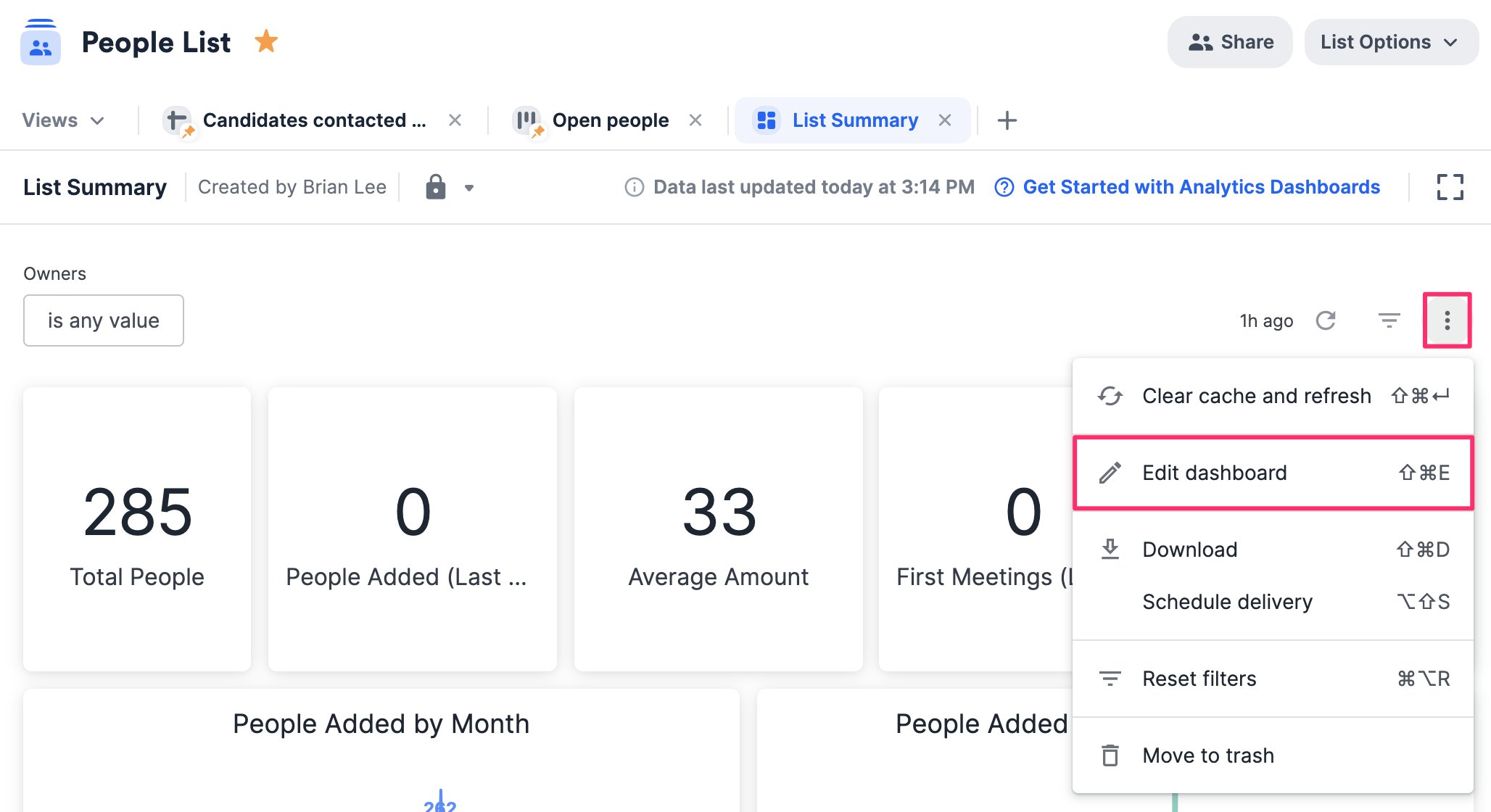
- Creators will see the Edit dashboard option when clicking on the ellipsis (3 dotted icon) in the top-right corner of a dashboard view, while Viewers will not.
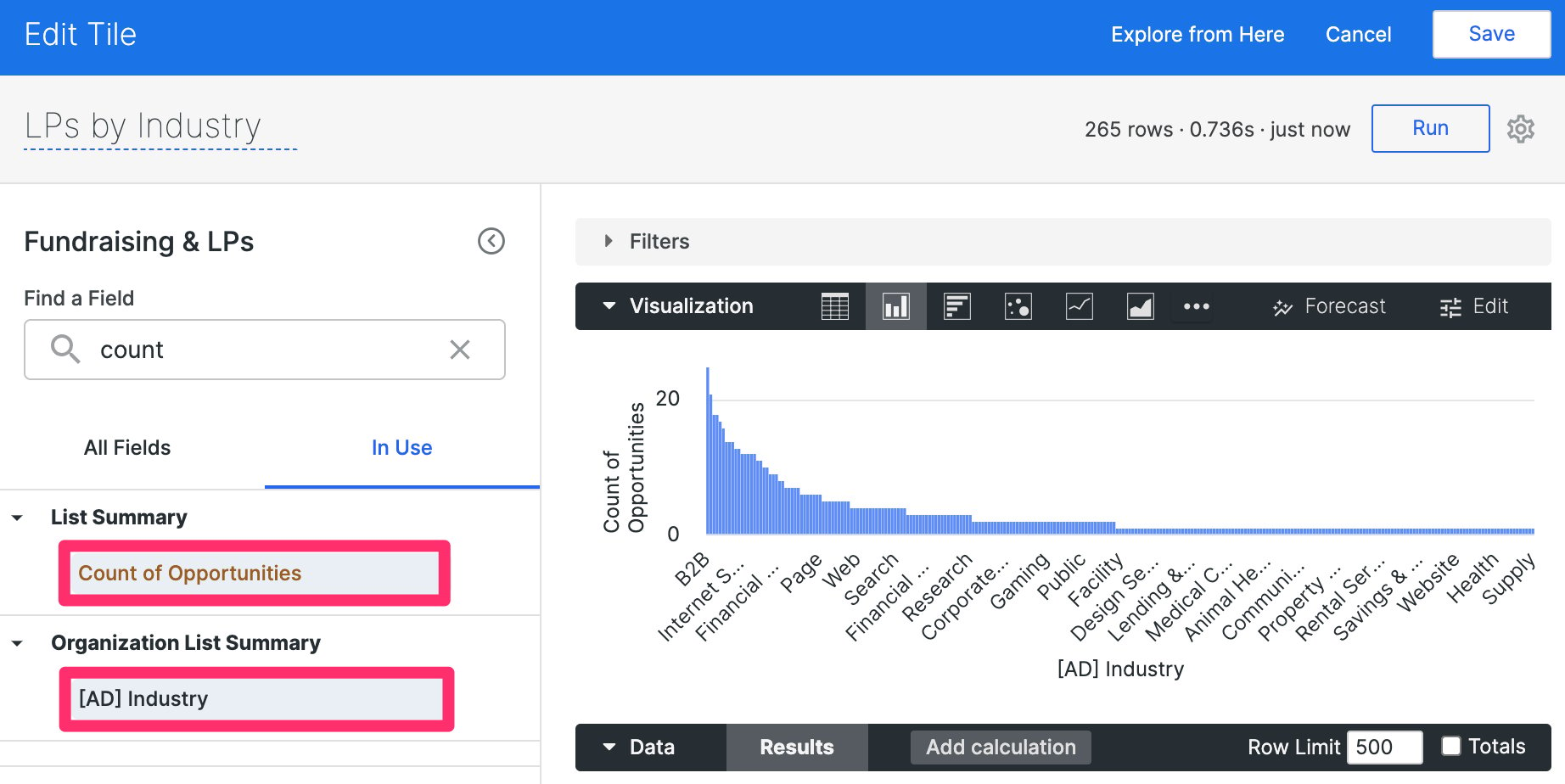
- Yes, organization-based enriched and global fields can be used in reports created within opportunity lists, check out the section “How to use organization-based fields in your reports for opportunity lists” in the article Affinity Analytics - List Summary Reports.
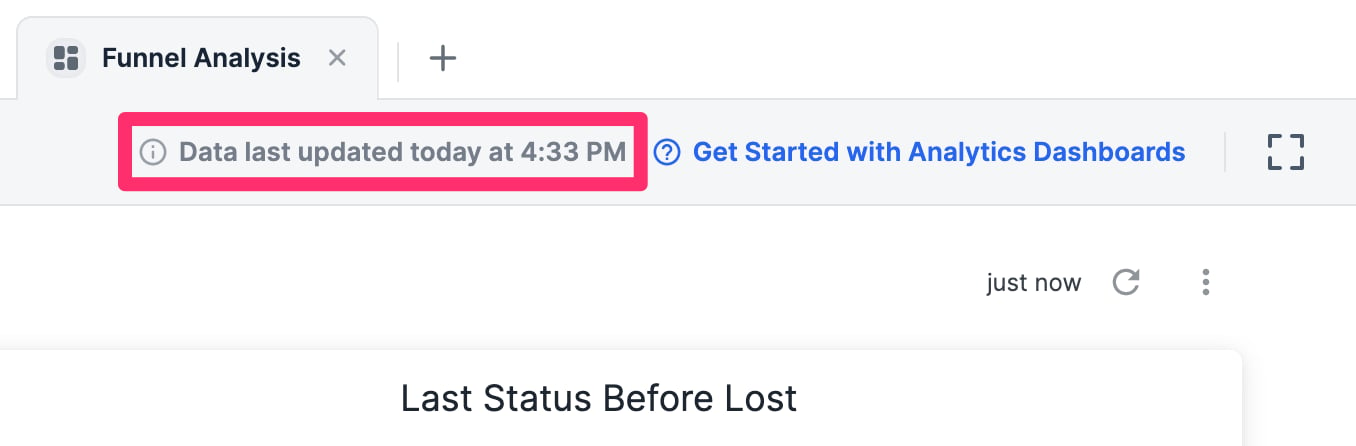
- “Data last updated” is based on the time zone you set in your Affinity Settings.
- Per our contract with Crunchbase, Crunchbase data cannot be used within Affinity Analytics.
- However, you can leverage our Affinity Data fields instead.
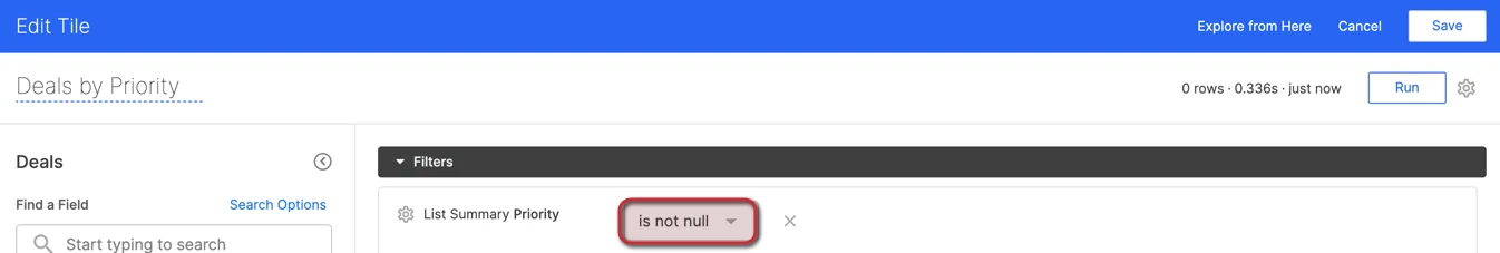
- NULL appears in some visualization tables when the fields being used are empty and do not have data.
- Simply add values to these fields for their respective list entries to reduce/eliminate the number of NULL values.

- If they are meant to remain empty, you can also filter out the NULL values.