> ## Documentation Index
> Fetch the complete documentation index at: https://support.affinity.co/llms.txt
> Use this file to discover all available pages before exploring further.
# How To Pivot Data On Your Dashboard Views
> Help center reference
**How-to** — task-oriented recipe.
You can pivot data on your dashboard views to break down your visualizations even further.
**Note**: If you're interested in setting up Affinity Analytics for your account, please reach out to your designated CSM or reach out to [support@affinity.co](mailto:support@affinity.co) and we'd be happy to help.
### How to pivot data on your dashboards
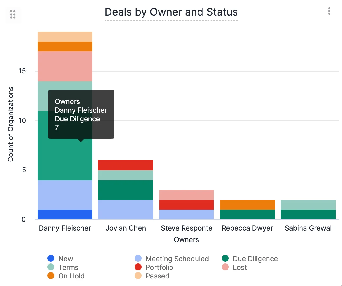
In this example below, we will see how many deals each owner is responsible for, then **pivoting by Status field** to further breakdown the statuses for these deals.
1. Click into the list that contains the dashboard view you'd like to pivot data on - for this example, we'll click into the **Deals List**.
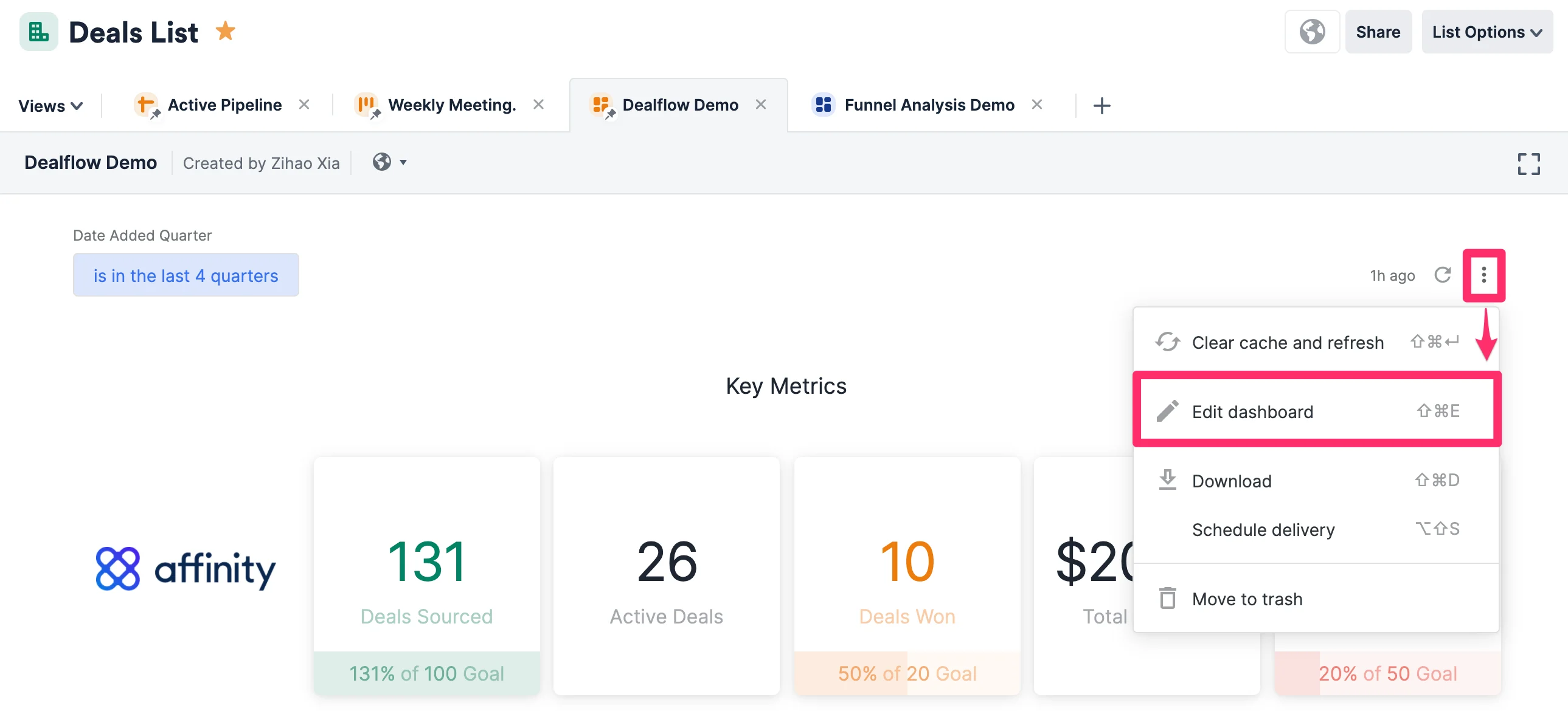
2. Click on the relevant dashboard view, then click the **ellipsis (3-dotted icon)** to click **Edit dashboard**.
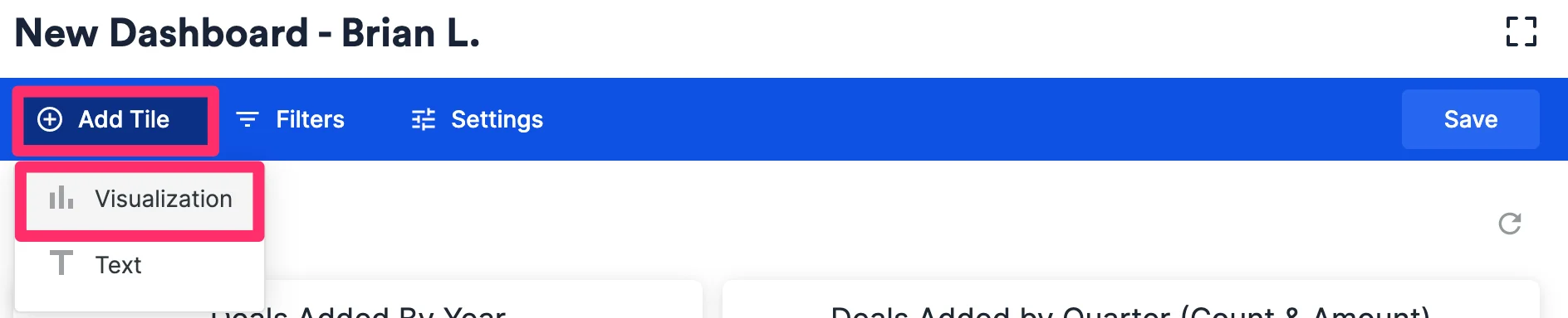
 3. Click **Add Tile** to create a new **visualization tile**.
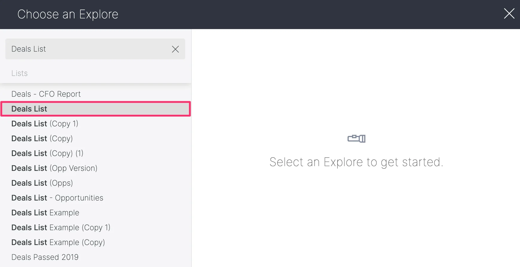
 4. Select the list you want to generate a visualization for. Given that we're creating this visualization within the **Deals List**, we will select the **Deals List**.
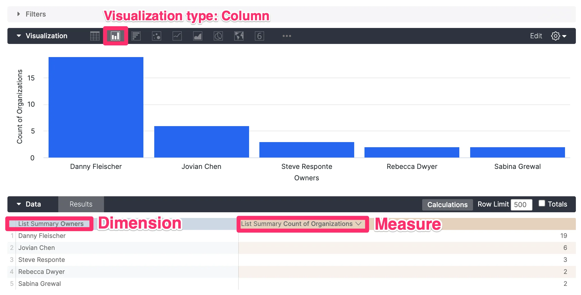
 5. On the left side, you should see **All Fields** found in the list. Select the **Owners** field (the dimension) and the **Count of Organizations** (the measure). Make sure to select **Column** as the visualization type.
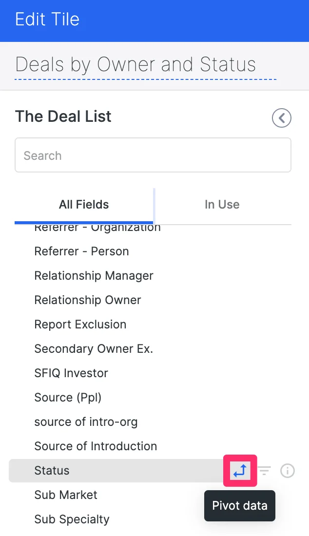
 6. Now, if you want to know all the statuses of each deal, you would have to add the **Status** field as an additional dimension to pivot by.
1. You can directly click the **Pivot** icon while you're adding **Status** as an additional dimension.
6. Now, if you want to know all the statuses of each deal, you would have to add the **Status** field as an additional dimension to pivot by.
1. You can directly click the **Pivot** icon while you're adding **Status** as an additional dimension.
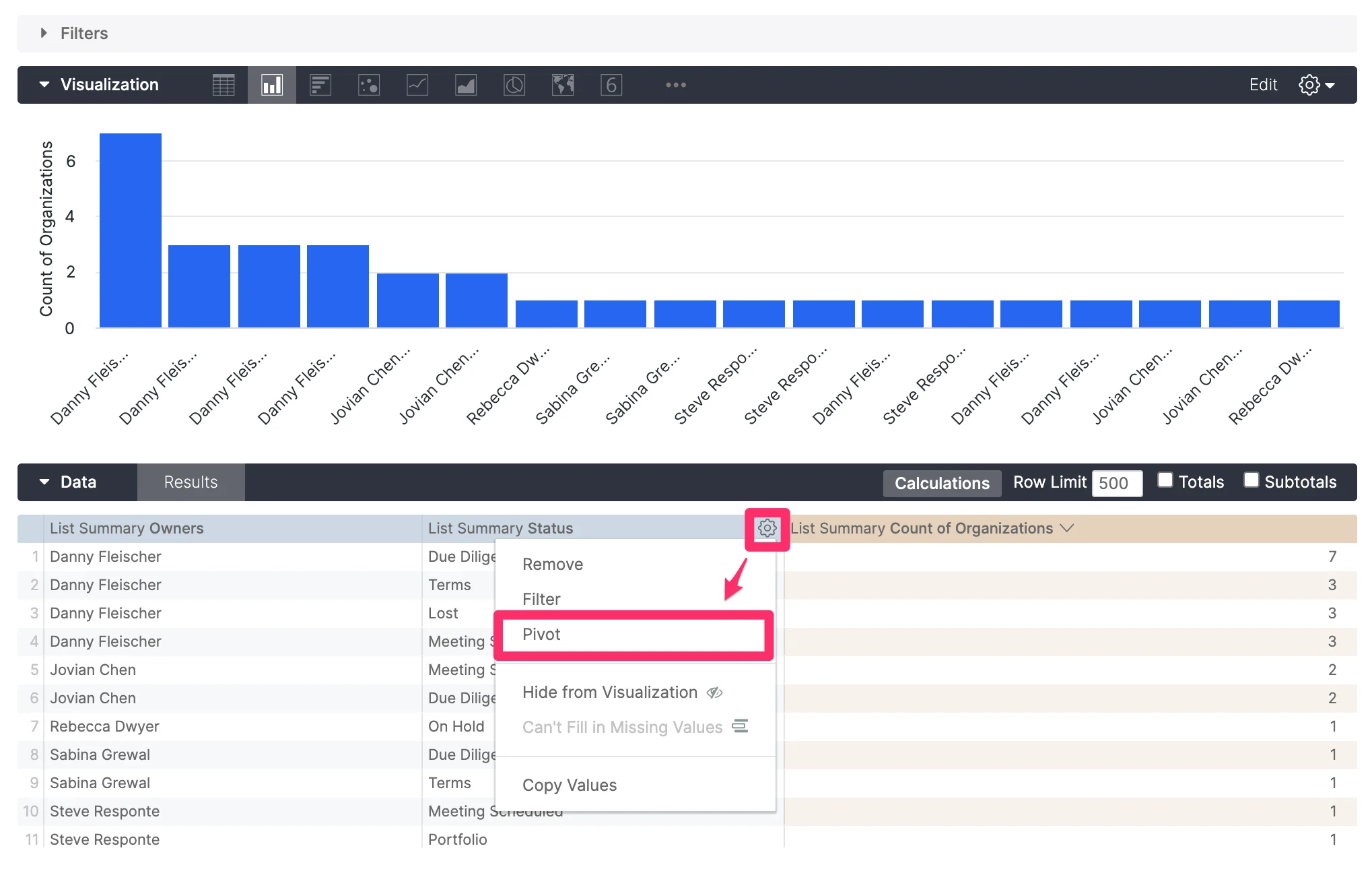
 2. Otherwise, you can click on the **Settings** icon for the Status field to pivot by the Status field within the **Data** section.
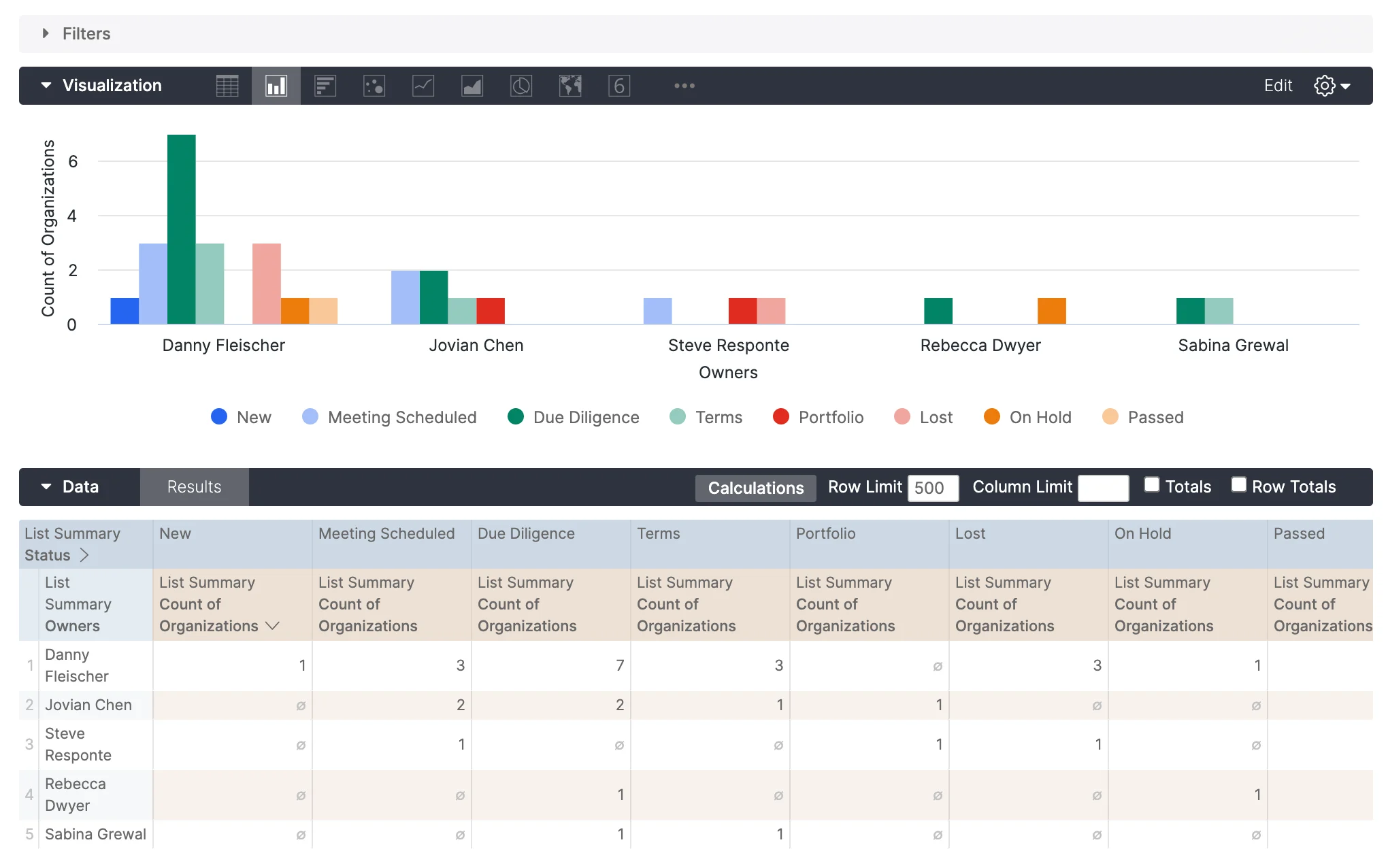
 7. Click **Run** on the top-right corner, and you should see the column chart change to look like the following below.
 8. Given that there can be many options for the **Status** field (the dimension that you pivot on), you can also click **Edit** on the **Visualization** section, then change it from **Grouped** to **Stacked**. It should now condense the multiple columns for each owner into a single column.
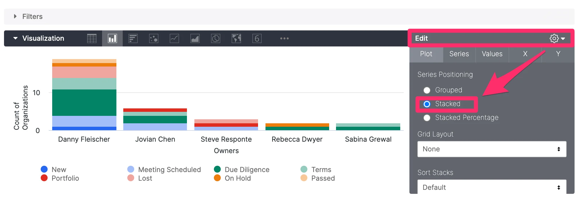 9. Click **Run** once more to make sure everything is up-to-date, then click **Save**.
10. Now, you will be able to see all the Owners on the x-axis, then see the breakdown by the **Status** field for all the deals that they own.
9. Click **Run** once more to make sure everything is up-to-date, then click **Save**.
10. Now, you will be able to see all the Owners on the x-axis, then see the breakdown by the **Status** field for all the deals that they own.
 ## Related topics
- [How To Apply Filters In Dashboard Views](/s/article/How-to-apply-filters-in-dashboard-views.md)
- [Affinity Analytics Funnel Analysis Reports](/s/article/Affinity-Analytics-Funnel-Analysis-Reports.md)
- [Affinity Analytics Team Activity Reports](/s/article/Affinity-Analytics-Team-Activity-Reports.md)
- [Affinity Analytics List Summary Reports](/s/article/Affinity-Analytics-List-Summary-Reports.md)
- [Getting Started With Affinity Analytics](/s/article/Getting-started-with-Affinity-Analytics.md)
## Related topics
- [How To Apply Filters In Dashboard Views](/s/article/How-to-apply-filters-in-dashboard-views.md)
- [Affinity Analytics Funnel Analysis Reports](/s/article/Affinity-Analytics-Funnel-Analysis-Reports.md)
- [Affinity Analytics Team Activity Reports](/s/article/Affinity-Analytics-Team-Activity-Reports.md)
- [Affinity Analytics List Summary Reports](/s/article/Affinity-Analytics-List-Summary-Reports.md)
- [Getting Started With Affinity Analytics](/s/article/Getting-started-with-Affinity-Analytics.md)